
Back to Browse

Dotplot MCP Server

Developer ToolsUse Caution4.2MCP RegistryLocal
Free

Server data from the Official MCP Registry

YC's Dot Plot as an MCP server — aha moments, funnels, retention for early-stage founders.

About

YC's Dot Plot as an MCP server — aha moments, funnels, retention for early-stage founders.

Security Report

4.2
Use Caution4.2High Risk

This is a well-designed analytics MCP server with clear separation of concerns (computation in analysis.py, MCP exposure in server.py). Security posture is solid: no hardcoded credentials, credentials sourced from environment variables, proper input validation on database queries, and explicit consent mechanisms for data sharing. Minor code quality issues (broad exception handling, some missing input validation) and filesystem write permissions are appropriate for its purpose as a local analysis tool. Supply chain analysis found 5 known vulnerabilities in dependencies (0 critical, 5 high severity). Package verification found 1 issue.

5 files analyzed · 11 issues found

Security scores are indicators to help you make informed decisions, not guarantees. Always review permissions before connecting any MCP server.

Permissions Required

This plugin requests these system permissions. Most are normal for its category.

File System Read

Reads files on your machine. Normal for tools that analyze or process local data.

File System Write

Writes or modifies files on your machine. Check that this is expected for the tool.

HTTP Network Access

Connects to external APIs or services over the internet.

env_vars

Check that this permission is expected for this type of plugin.

database

Check that this permission is expected for this type of plugin.

process_spawn

Check that this permission is expected for this type of plugin.

How to Install

Add this to your MCP configuration file:

{
  "mcpServers": {
    "io-github-brownglasses-dotplot-mcp": {
      "args": [
        "dotplot-mcp"
      ],
      "command": "uvx"
    }
  }
}

Documentation

View on GitHub

From the project's GitHub README.

Dot Plot MCP

See individual users, not aggregate charts.

English | 한국어
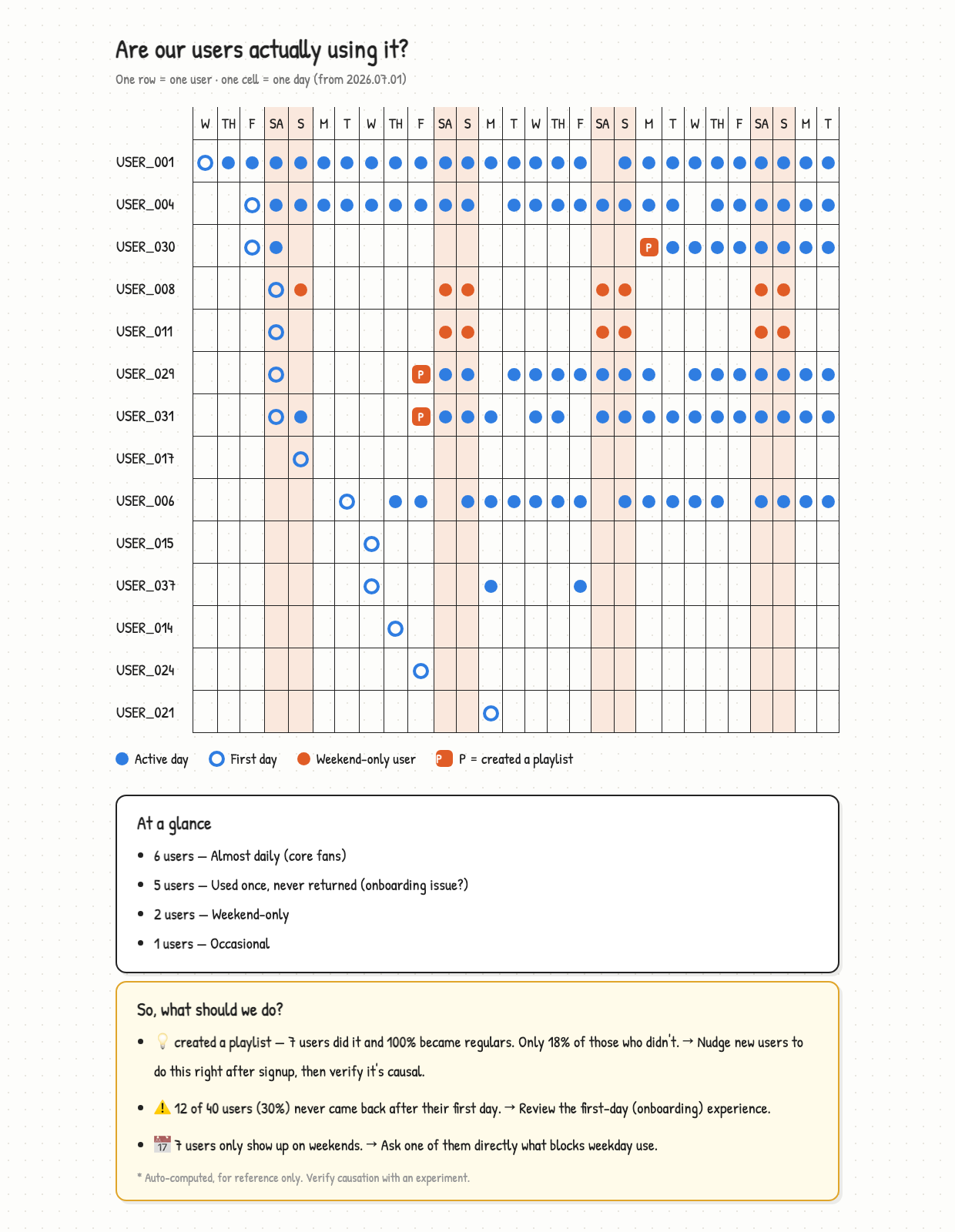
report

DAU/MAU charts trend "up and to the right" as long as new users arrive — even when nobody sticks. This MCP server implements YC's Dot Plot methodology (David Lieb): until you have hundreds of users, the most informative dashboard is one row per user, one cell per day.

Design principle: code computes the numbers, AI only interprets them. Statistics never come from an LLM, so they are never wrong.

What it does

1. Tracking audit   compare events in your code vs events in your data → find broken/missing tracking
2. Dot plot         every user's activity as dots — churn, weekend-only, core fans at a glance
3. Classification   used-once / weekend-only / almost-daily, automatically
4. Aha moments      scan every action for "what turns users into regulars"
5. Report           hand-drawn style HTML + plain-language insights → share as a link
6. Benchmark        (opt-in) compare your metrics with teams at your industry & stage

30-second demo

demo

Quick start

Requirements: uv, and a 3-column CSV: user_id, date, event.

One command — no clone, no setup:

claude mcp add dotplot -- uvx dotplot-mcp

No data yet? Clone and try the sample:

uv run sample_data.py   # generates events.csv (40 fake users)
uv run demo.py          # watch the whole pipeline run

Then ask Claude:

"Analyze events.csv and find my aha moment"

Exporting from your own DB is one query:

SELECT user_id, created_at::date AS date, 'purchase' AS event FROM orders;

Tools

ToolWhat it does
describe_eventsUnderstand the data shape (always call first)
dot_plotText dot plot (◎ signup day, ● active day, custom marks)
classify_usersAutomatic behavioral pattern classification
find_aha_momentsScan all events for "regular-converting" actions (before/after behavior change)
onboarding_funnelSignup → first value → return → still active: where users leak
retention_curveWeekly retention — the number investors always ask
load_from_dbPull events straight from Postgres/Supabase (no CSV export step)
history_compare"Since last report" deltas — snapshots auto-saved locally on every report
find_similar_casesMatch your diagnosis to real documented cases (Facebook's 7-friends, Slack's 2k messages...)
audit_trackingCompare events in code vs data (find tracking gaps)
generate_reportHand-drawn style HTML report + rule-based insights
publish_reportHost the report at a random URL, get a share link (Vercel)
submit_benchmarkSubmit aggregates to the anonymous benchmark (explicit consent required)
compare_benchmarkCompare your metrics with percentiles of similar teams

Languages

Reports work in any language. English, 한국어, and 日本語 are built in; for every other language the agent translates the report strings on the fly (get_report_strings → translate → custom_strings), while the code validates that number placeholders survive translation — so statistics stay exact. Want your language built in? It's one dictionary in i18n.py. PRs welcome.

See the same report in English · 한국어 · 日本語.

Anonymous benchmark — what gets sent

Opt-in only. Nothing is ever sent without explicit consent.

If you consent, these five aggregates are sent — and this is everything:

{
  "users_count": 40,
  "churned_rate": 0.30,
  "weekend_rate": 0.175,
  "regular_rate": 0.275,
  "aha_lift": 0.82
}

Never sent: user IDs, event logs, dates, your service's name, IP-based identifiers.

The backend is INSERT-only (row-level security) — submitted data cannot be read back with the public key, and comparisons go through a function that returns percentile statistics only. Verify yourself: benchmark.py (~60 lines).

Architecture

analysis.py    all computation — pure Python, knows nothing about MCP (the brain)
server.py      thin shell exposing computations as MCP tools
report.py      HTML report rendering + rule-based insight sentences
benchmark.py   anonymous benchmark client
i18n.py        every user-facing sentence, per language
harness.py     run the whole pipeline end-to-end without an agent
sample_data.py sample data with planted patterns (for verifying the tool)
hosting/       Vercel project template for report hosting

Why it's built this way

  • LLMs don't compute — same data, same numbers, every time
  • Small samples withhold judgment — groups under 5 users are excluded from aha candidates
  • Correlation ≠ causation — every insight ships with a "verify with an experiment" warning
  • Vanity metrics blocked — pick open_app as your value event and it tells you to pick again

FAQ

How do I analyze user flows / user behavior for my early-stage product? If you have under ~1,000 users, skip the heavyweight analytics suites. Export a 3-column CSV (user_id, date, event) or connect your Postgres, then ask Claude to draw a dot plot — one row per user, one dot per active day. Churn, weekend-only users, and habit changes become visible in seconds. That's exactly what this MCP does.

How do I find my product's aha moment? find_aha_moments scans every event and measures, per user, how activity changed before vs after first doing that action — so frequency noise (scrolling, popups) doesn't fool the ranking. The report aligns all users on "day zero" so you can see the habit change with your own eyes.

How is this different from Mixpanel / Amplitude / PostHog? Those are built for thousands of users and aggregate charts. This is built for your first hundred: per-user visibility, runs locally inside your coding agent, no SDK, no signup, stats computed by code (never by the LLM). Graduate to the big tools later — this is the stage before them.

License

MIT

Reviews

No reviews yet

Be the first to review this server!